0
Completed
Default views
Default view for each wavelength should be the most representative/appealing.
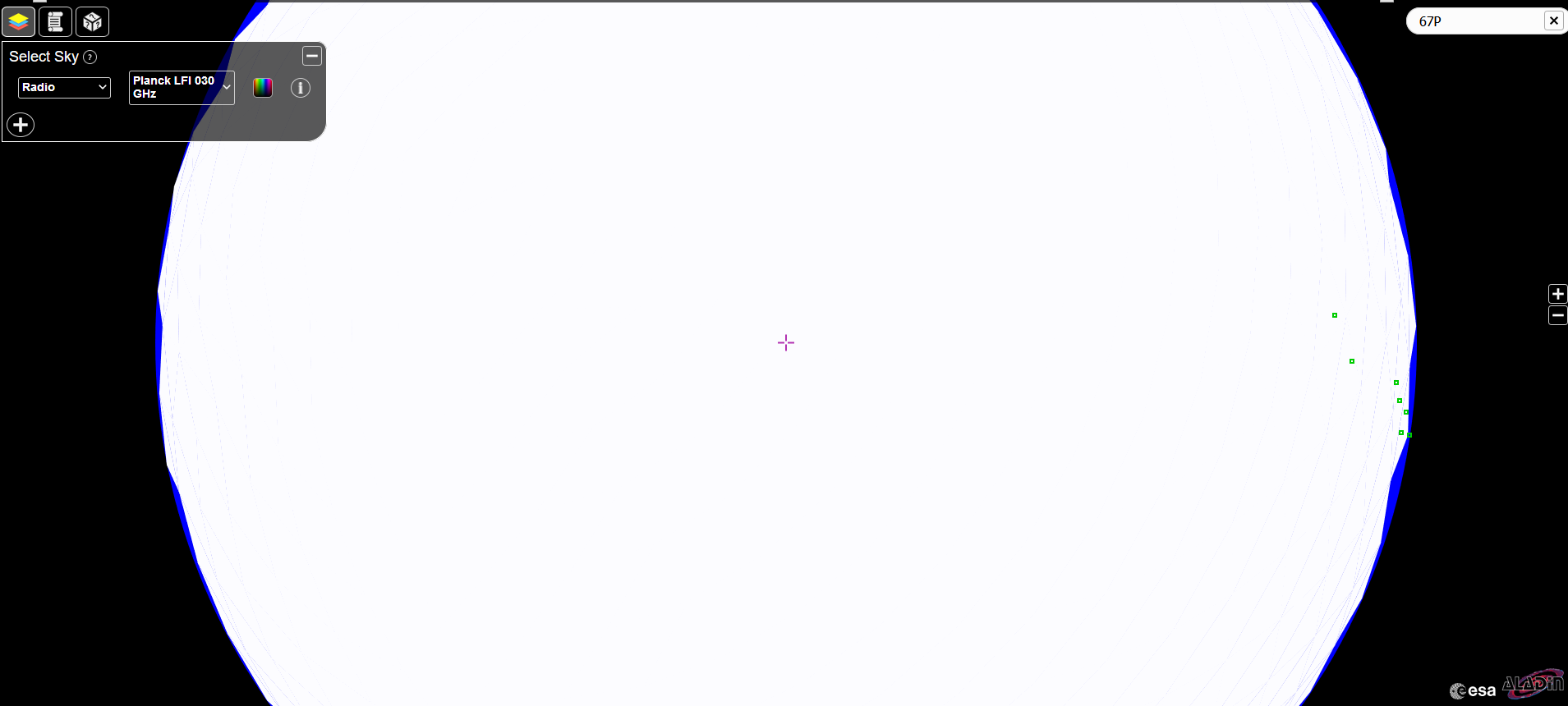
eg. right now if you switch to Radio you get a white blob, pictured below. Until you switch color palette into Native - it stays as a blob. That's super-confusing.
I'd also recommend changing color palette into a drop-down, cause UX-wise it's weird to have 2 selectors in drop-downs and a third one hidden under a button. Initially I thought it's just an icon to signify that a different "select a sky" drop-down will have a different color palletes...

Customer support service by UserEcho


Dear Jareel,
thanks for reporting this issue. Unfortunately, I cannot reproduce it, for me the map is loaded without any issues. Could you please tell us your operative system and browser, so that we can investigate further?
Regards,
Belén
See
https://esdc.userecho.com/communities/1/topics/144-colour-palette-possibly-works-in-an-incorrect-way#comment-201